1. How to navigate the SAP Learning Hub analytics dashboard?
You can navigate the SAP Learning Hub analytics dashboard by using the two main pages Learning Activities, and Learning Achievements, to view different learning data. Use the date range of filters to narrow data by time, explore learner activity in the Explore and Export Data section, and save custom views using Bookmarks. You can also export data and use the small “i” icons to understand the terminology.Watch the quick video to learn more about how to navigate the SAP Learning Hub analytics dashboard.
Watch the quick video to learn more about how to navigate the SAP Learning Hub analytics dashboard.
2. Overview of dashboard layout
Upon opening the dashboard, you can get a single view of all the SAP learning taking place in your organization. You’ll notice several key areas:
- Main navigation:
Located at the very top of the dashboard, the Main navigation section allows you to seamlessly switch between the primary analytics pages: Learning Activities and Learning Achievements

Any important messages and announcements can be found in the top right corner, including data loading status notice for each page. Beneath the title, you may find the latest release date and a direct link to the related release notes.
The upper right corner of the navigation also provides additional tools to enhance your experience. Click the blue Explore and Export Data button to access advanced options for downloading and analyzing detailed data.
Tip
For further assistance or documentation, use the Learn More button, which gives you quick access to help materials and release notes.
- Page filter bar:
Positioned directly beneath the Main navigation section, the Page filter bar empowers you to filter dashboard data by various criteria, such as Activity, Date Range, Country / Region, Learning Format, or Solution Area, depending on the selected page.
Adjusting the filters dynamically updates the visualizations and data across the selected dashboard page for tailored analysis.
Note
Some visualizations, such as Ordered and Assigned Licenses, Valid Certificates, and Certified Learners, always display organizational totals. These are indicated by the Filters not applied label, meaning these figures are not impacted by the page filters.
- Data visualizations area:
Is the core of the dashboard, displaying dynamic Key Performance Indicators (KPI) tiles and charts, based on your current selection and applied filters. To optimize loading times, most content sections (apart from the KPI tiles) are collapsed by default. Simply expand these sections to view more detailed analytics as needed.
- In-app info and glossary:
Look for the Info(i) icon within the dashboard to access immediate guidance, and definitions of key terms, ensuring you always understand what you’re seeing and how to use it.
Note
Don’t see the expected data?
Double-check your applied filters to confirm the appropriate dates, regions, or learning formats are selected.
3. How to stay informed of the latest data status?
The status notice in the top-right corner of every page of the dashboard keeps you informed on the latest data displayed. You can find:
- A green notice:
that indicates the data on the selected page is refreshed according to the daily schedule, providing the date of the latest records.

- A yellow notice:
if the data loading process is delayed, indicating the date of the latest available data. As soon as the loading process is complete, the message will be updated accordingly.

4. How to use filters and customize my view?
Filters allow you to tailor the dashboard view according to your needs, helping you focus on specific learner segments, timeframes, or learning formats. The dashboard offers two types of filters to maximize your flexibility.
- Utilize the primary filters in the Page filter bar:
The primary filters, located at the top of the dashboard, allow you to adjust key parameters for your analysis, such as Activity Date Range, Country / Region, Learning Format, or Solution Area. Simply click on each filter category to reveal a drop-down menu of available options and apply the selection.
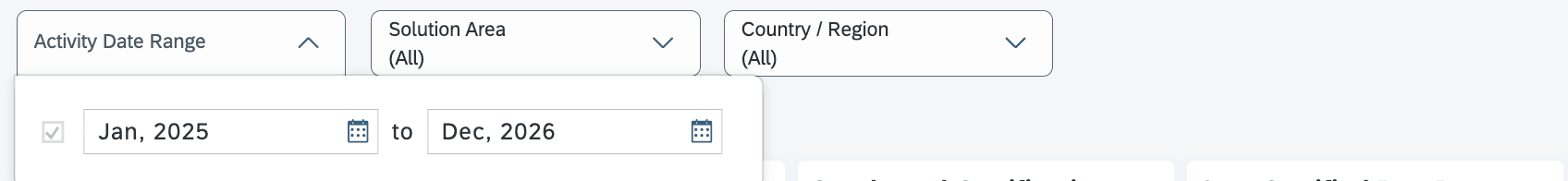
After applying your desired filters, all relevant metrics and visualizations will update the entire page to reflect your choices. For example, you can narrow the dashboard to show only completed certifications within the past quarter or analyze engagement for a specific learner group.
Note
Some summary tiles or charts may not be affected by every filter. If that's the case, aFilters not appliedtag will be displayed for transparency.
- Utilize chart-specific filters:
These are designed to give you more granular control over the data visualizations. For instance, letting you further refine results by Learning Type StatusCertification Exam Result, or other attributes within a specific chart.
To apply a filter, select the desired value and click the Filter icon.

To remove a chart-specific selection, click on the three dots in the top right corner of the visualization, go to Applied to Chart and press the “x” sign on the desired filter, as shown below:

Note
Only some charts within the dashboard include additional filter options for the dimensions that are not available in the primary filters.
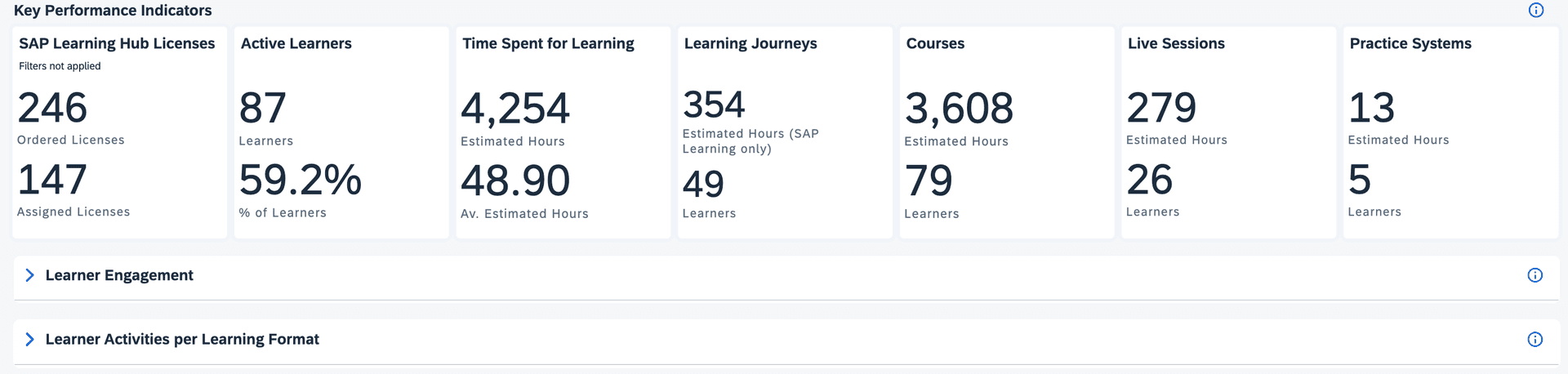
5. Understanding Key Performance Indicators (KPIs)
The dashboard features a series of Key Performance Indicators (KPIs) displayed at the top of each analytics page. These high-level metrics offer quick insights into overall learning activity and achievement trends. Common KPIs include:
- Active Learners:
Number of unique learners who have engaged in learning activities within the selected time period. - Time Spent for Learning:
Sum of all estimated hours of the learning activities performed by the learners for the selected date range. - Valid Certificates: Total number of currently valid certificates held by the learners in scope of the SAP Learning Hub analytics dashboard (regardless of the selected time frame).
Note
Click the Info (i) icon on the right side of each section to get a better understanding of KPI definitions.
The KPI tiles are dynamic and will automatically refresh to reflect changes as you adjust either primary or chart-specific filters, ensuring you always see data relevant to your selected analysis. If a particular tile or KPI is not influenced by the filters you have applied, a Filters not applied tag will appear, clearly indicating that the metric displayed remains unaffected by your current filter selections.
6. Data visualizations sections
Beneath the KPI overview, the dashboard offers detailed sections for deeper analysis. Each section focuses on a specific aspect of learning data, such as learner engagement, activity breakdown by learning format, certifications, and records of achievements.

These sections are expandable and collapsible. Click the arrow icon next to a section header to reveal more data visualizations within that category.